
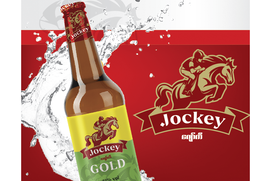
Jockey It is a very challenge work for Spikebrand to rebrand “Jockey” which has 3 different variances targeting 3 different target groups. This brand has long establishment more than 30 years as hard liquor in lower market but tried to target upper market with new variance called “ Jockey Gold 35” and aimed to launch new variance for younger generation as ready to drink liquor. Our job was to modernize Jockey but yet still make current consumers to recall their brand! We helped our client to set up architecture of all variances by designing new identity, naming new variance, designing packaging system & branding template for 360 degree materials.
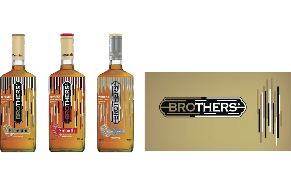
Brothers Most of the whisky brands in Myanmar present their brand with high-class status. Our challenge was to launch new whisky brand which the different positioning. We named the new whisky brand as “ Brothers’ ” as same as the surname of the owner and this name can also refer to “Bro” or young man who is the target of whisky. This name is very good tool to build on the story and it was used to write the song to make consumers remember and feel relevant to the brand. As a new brand, the facing of products on shelf is limited, we helped client to solve this problem with the new shape of bottle that represent “modern” concept as well as creating shelf impact. Besides from position, naming, identity and packaging design, we ensure branding consistency for brand awareness by branding template for communication and point of purchase.

Empire The challenge of this project was to launch new rum brand to complete with the leader brand, Mandalay Rum, which was in the market more than 100 years with well-known reputation as national rum of Myanmar. We helped the client from the very first step since positioning, naming, identity, bottle shape and all branding touch points from communication, store and point of purchase. The new brand iscalled as “Empire” with the visual of lion by Joey’s brush stroke to represent the feeling of “East meets West” in the artistic image which is suits for rum consumers who don’t only look for drink but pleasure.

Big C retail: The challenge was to modernize the design and brand properties that would be key to Big C future success. We redesigned the logo and applied this to the whole look of Big C’s retail outlets — Big C Extra, Mini, Jumbo and Pure.
Big C packaging The challenge was the complete re-design of Big C’s house brand products. This involved creating a new story, design system, logo and packaging.

Siam Amazing Park The challenge was to create a whole new strategy, story and look for Bangkok’s oldest theme park. That required everything from training staff to rewriting all brand communications and developing a new name and logo for the park. We created a new hero character and developed new designs for the interior, exterior, signage, uniforms and advertising templates.

Nation The challenge was to take one of Thailand’s most trusted media names and give it a new and modern feel that was still easy to recognize. We worked with the management to understand what story they wanted to project and what they saw as the key elements of the old logo. These were incorporated in our redesign of the logo and the new, matching ‘look’ of the brand.
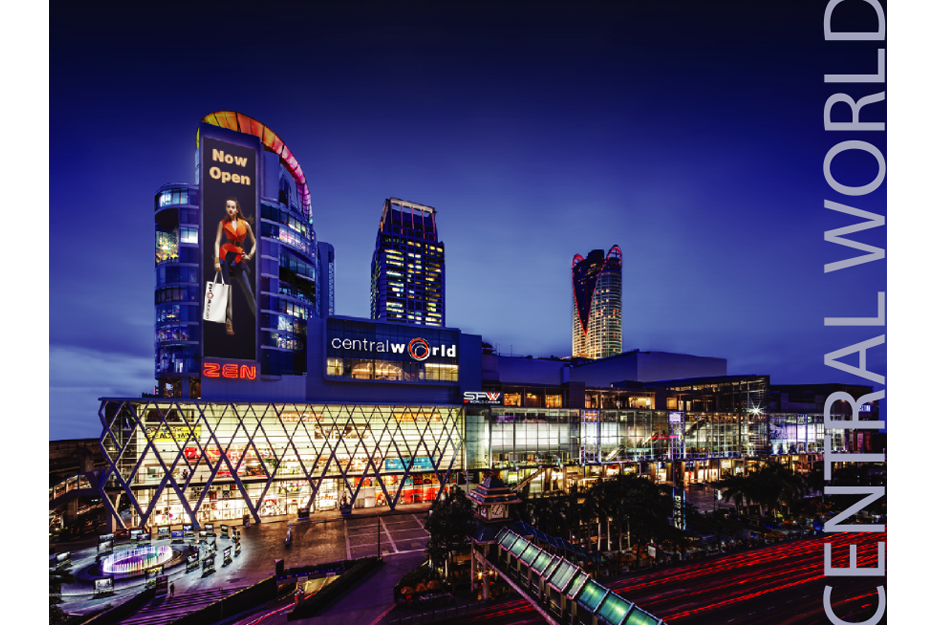
CPN The challenge was to spike new interest with a redesign of the look and feel for key brand properties. We created a new look, logos and applications for their Central World, Central Plaza, and Central Festival shopping centers.
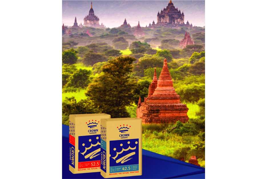
Crown Cement The challenge was to take northern Myanmar’s largest but now fading cement brand and give it new life in the face of increasing international competition. We built a story linking the brand to the people of the region, created a logo and brand identity to match, and then developed new packaging and brand applications for all aspects of their communication.
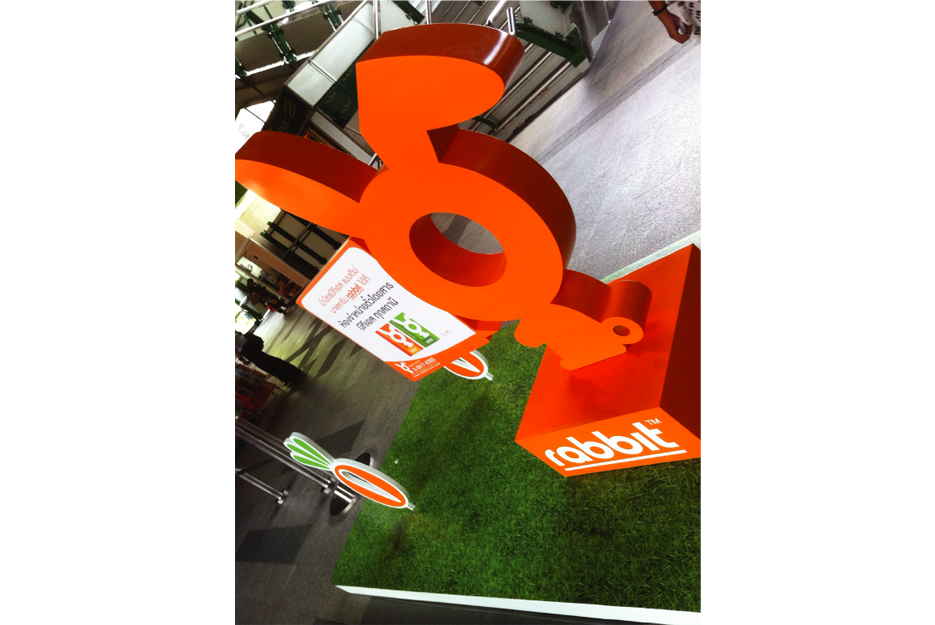
Rabbit The challenge was to undertake a major project for Bangkok’s mass transit system, the BTS. We came up with the dynamic and popular rabbit logo, which is applied to the public transport ‘rabbit’ card and other product items.
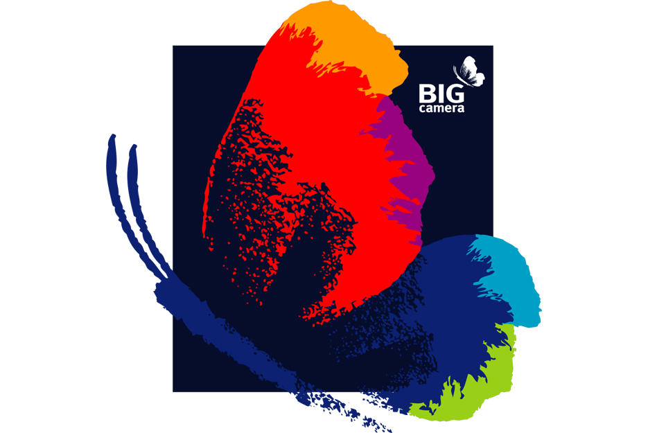
Big Camera The challenge was to reinvigorate interest in Thailand’s biggest retailer of photography equipment. That meant making a total change in all design aspects of the business — BIG Camera, BIG Gallery and BIG Mobile retail sites. Our re-design provided a new and modern “look and feel” while still retaining memorable elements of the old logo.
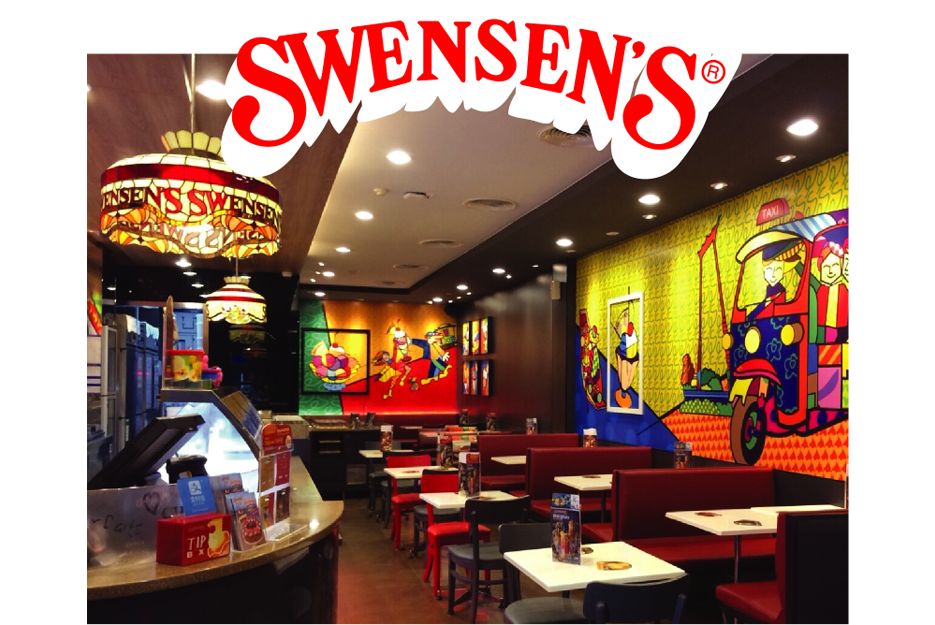
Swensen’s The challenge was to help Thailand’s premier ice cream brand keep its restaurants looking lively, inviting and fun. We undertook the interior design, menu design, and design of promotional material for bright new extensions to the brand story.
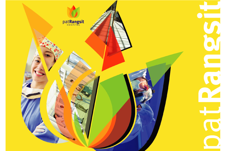
Pat Rungsit The challenge was to take a functional but unattractive hospital and give it a look and story that would enable it to compete in the health tourism marketplace. We decided on a complete revamp of the interior, exterior and all communications to give it a look of hope and a bright future.
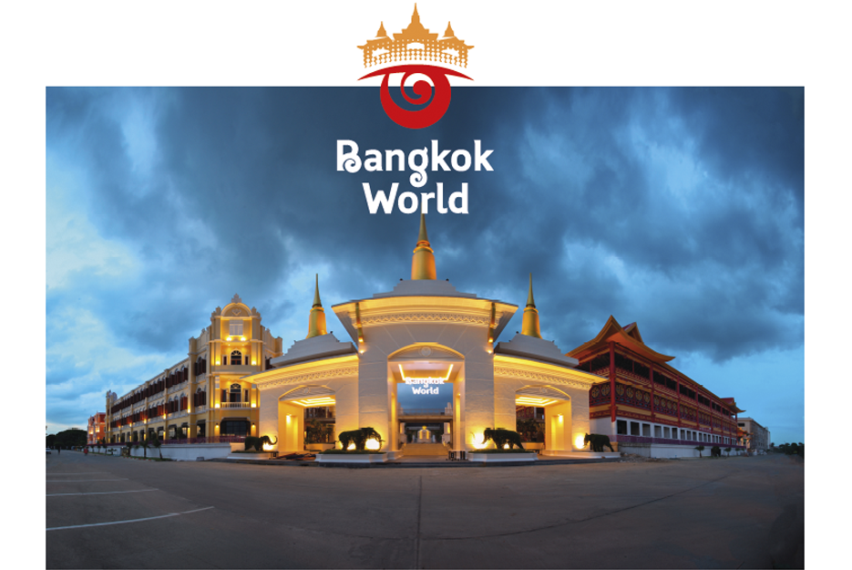
Bangkok World The challenge was to build a brand from scratch for this new family fun park. We created a background story, name, logo and look for the park. We then developed a unique theme for each building, through developing unique building signage and interior graphics..
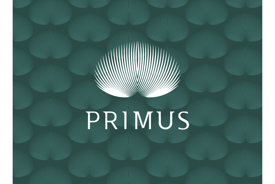
Primus We helped this young, local jewelry brand become an international luxury brand with a new design of its logo, shop interiors, packaging and communication template. The challenge was how to combine the owner’s lucky number, 51, into their beautiful new peacock logo. Spikebrand takes care of all details to ensure brand success — if you count, you will find exactly 51 peacock feathers in the Primus logo.
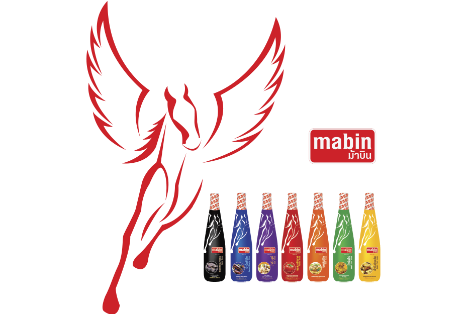
Mabin Joey and Spikebrand helped to freshen the image of this local chilli sauce through a new logo, packaging design and branding template. We created a brand book to ensure consistency in all marketing and communication, helping the client maintain a strong image and corporate identity. We also set up a packaging design system for the client to apply to other sauces produced under the same brand. The proven results led the client to work with Spikebrand again after seven years, for logo design evolution and new packaging design.